The brief
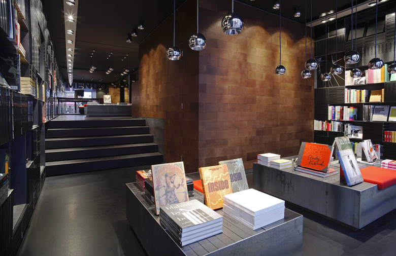
When Mendo approached us about the project, they had a simple brief: translate the experience of visiting their beautiful Amsterdam store to the web. If you've ever visited Mendo, you will realise that this is easier said than done. Their shop is a dimly lit, cavernous space where the walls not made of bricks, but of thousands of custom-made black Mendo books. A bookstore made of books. Scattered throughout the space are small piles of books on photography, fashion and design. Their colourful images complement the dark walls perfectly. Next to their impeccable presentation, service is equally important at Mendo and they go to great lengths to make shopping at Mendo a pleasure. How does one go about translating that experience to the web? We chose to go back to the core: the book.
The book
Just as Mendo literally built their physical store out of books, we would do the same for the online store. We also decided that the way books are generally presented online is terribly boring and doesn't do the contents of a book justice at all. Tiny thumbnails and and lengthy lists of metadata are not appealing. In our designs, we approached 'the book' from two angles: the book as a material object and the book's visual contents (and by extension, the book as a carrier for ideas).
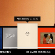
Early on in the project we made a bold decision: we would only show books on a shelf. One thing we didn’t like about the tiny thumbnails other bookshops use is that they do not take the material qualities of the book into account: they reduce the object to a small illegible image that has all but lost its relation to the actual book. By placing our books on shelves, we give them place and context. Their tactility is emphasized, even at small sizes.
Mendo books are exquisite objects that are beautiful even without opening them, and this is something we wanted to show. We do this by starting the gallery with a custom-made photograph of the book laying on a black surface. A huge, sharp, beautiful photograph.
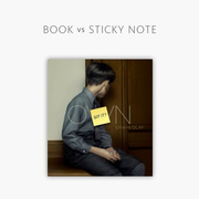
We also created "how big is this book". A feature where you can compare the size of a book with a sticky note or iPad. Judging the size of a book is something that is particularly hard when shopping online. Numeric measurements are not intuitive, and you don't want to make your visitors go look for a tape measure (although that is what every other online bookstore seems to be doing). On the other hand, nearly everyone knows how big a sticky note is, and most people know how big an iPad is.
When you open a Mendo book, it's contents are visually powerful and you quickly find yourself sucked into it's world. On the website, we achieve the same effect using crisp full screen images. The best books are the ones in which the images are not only visually appealing but also evoke ideas that shape the atmosphere which surrounds the experience of reading the book. Of course, this is quite an ethereal concept, especially when applied to a website. We tried to achieve a similar captivating experience by cropping full spreads to powerful full-bleed photographs. When reading a book, the distracting aspects of a spread blur into the background because of the book's material qualities. On a website, these material qualities are lacking, making the distractions of a full spread containing bylines, whitespace and complex compositions all the more apparent, and distracting from the visual experience of the book. Reducing visuals to a single image mimics the experience of reading the actual book much more closely.
A curated experience
In their physical store, Mendo makes a big effort to make every customer feel at ease. They know about each book they sell because they pick each book by hand. They also do not sell books that they personally think are lacking, and are not afraid to tell customers so. Mendo offers a curated selection of books: every book is there for a reason.
In the online store, these aspects have been woven into many parts of the site. Books can be browsed by way of curated shelves where Mendo and guest curators shares their thoughts about a selection of books. Every book has a review written by Mendo (not one boilerplate publisher's description). The Shelf Service feature allows you to request personal buying advice in the form of a shelf filled with books chosen by Mendo. If you're ordering a gift, just enter a personal message and Joost (with his examplary handwriting) will write your note and send it along with the book. Finally, if you're feeling adventurous, just go to any shelf and hit the 'buy all books' button. This will automatically put all those books in your bag, and you will be only a couple of clicks away from a huge pile of great books at your doorstep (and a sizeable hole in your bank account).
Beautiful seams
If everything looks the same, nothing stands out. Our design put much emphasis on using large images and sparse typography throughout the browsing experience, with the aim of drawing the visitor into a world where the book takes central stage. While very effective for browsing books, this approach also narrows the mental model a visitor forms, and limits it to a passive viewing experience. To break out of this similarity and activate the visitor we consciously created seams in the visual and interaction design that would function as a mental anchor for the visitor and effectively split the site into two realms. 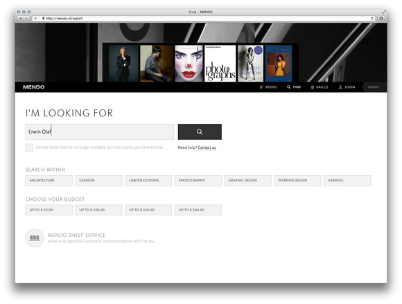
The first realm is the viewing experience. The second realm deals with everything that surrounds this browsing experience, the most important of which is actually buying books. By making the transition to a visitors bag – and the checkout pages – a very distinct one, we place extra emphasis on the fact that this is a shop.
Mark Weiser – a pioneer of ubiquitous computing – claimed that making technology seamless is akin to doing everything the same way, and that it is better to set focus on making seamful technology with “beautiful seams”. We tried to do just that.